 libreAdamlibreAdam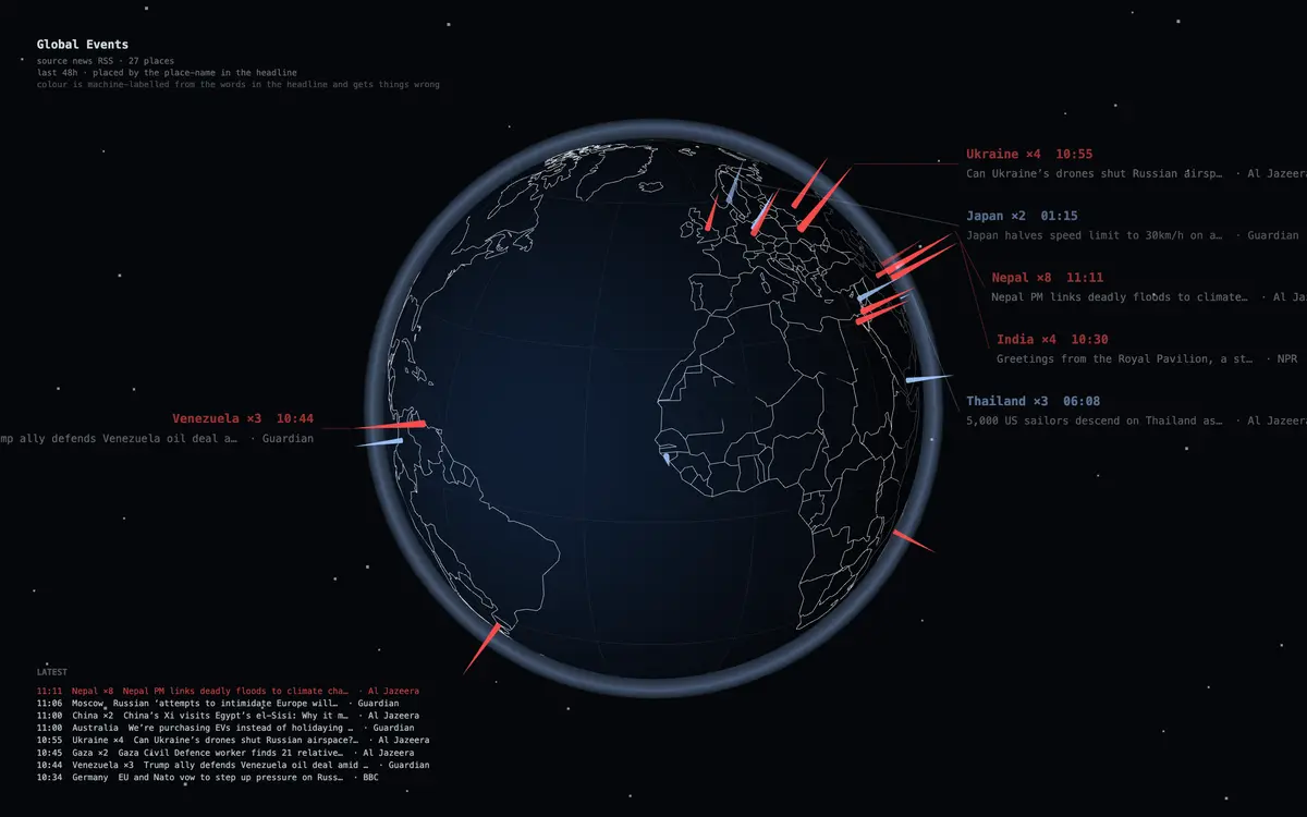
Global Events
全球事件
A turning globe. Two days of world news stand on the map, placed by the place-name in the headline — the busier a place, the taller its spike. Click one to read the story.
Open it →What is it
A real 3D globe that turns on its own, stops when you rest the pointer on it, and zooms with the wheel. Every story from the last forty-eight hours stands on the coordinates named in its headline: the more stories from one place, the taller the spike; the fresher the brighter, gone after two days. Click a spike to open the story in a new tab. Each spike gets a colour — red, green, or the base colour — machine-labelled from the words in the headline, and it gets things wrong; that sentence is on the screen too. The news comes from the public RSS feeds of the BBC, the Guardian, Al Jazeera and NPR, each spike labelled with who filed it; place-names are looked up in a table, never through a model. Or switch to live USGS earthquakes, where the length of a spike is the magnitude. The same data folds into a 24-hour ring, or a watch — one turn of the dial is one day, and whatever hour something happened, a spike stands there. Offline or unreachable, it falls back to a made-up batch and keeps turning.
Highlights
- News stands on the coordinates named in its headline; the busier a place, the taller the spike — click to read it
- Colour is machine-labelled from the words in the headline and gets things wrong (it says so on screen); each colour can be switched off
- Switch to live USGS earthquakes, where the length of a spike is the magnitude
- The same data folds into a 24-hour ring, or a watch
Related
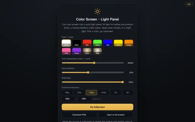 Color Screen · Fill Light Color Screen · Light PanelTurn the whole screen into a lamp — nine colors to pick from.
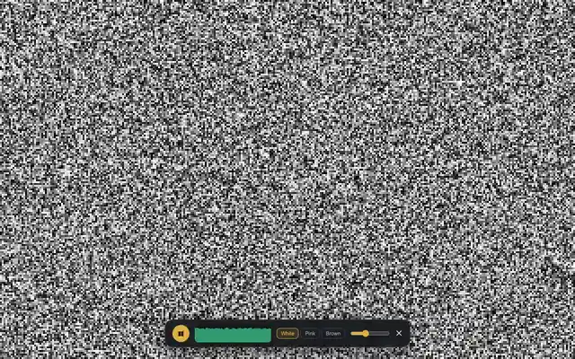 White Noise Screen White Noise ScreenA screen full of static and a steady hiss — enough to bury an open-plan office.
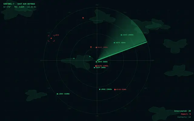 Radar Screen Radar ScreenThe sweep line circles, the intercept count climbs — and nothing is actually being scanned.
 Screensaver Five-Pack Screensaver PackThat DVD logo the whole internet waits on — now it finally counts your corner hits.
 In a Meeting Busy in MeetingA screen full of meetings — who’d dare pull you into work.
 System Updating Updating…27% · Don’t turn off — this one runs two hours.